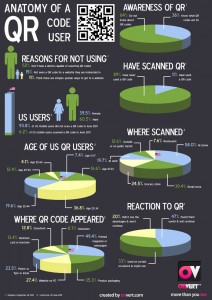
Statistics compiled as part of research for onvert.com – an Augmented Reality platform. I pulled together statistics from two reports, one from Simpson Carpenter, UK and the other from comScore, both in 2011 to put together the statistics. QR code usage in America is slightly behind the UK, who are again behind Japan and neighbouring countries who are earlier adopters of technology.
The most surprising number for me were the numbers of QR codes seen on television – which seems to be a bit of a daft place to put it unless you manage to keep it on screen for an extended length of time. Waitrose did something similar one year, but failed to keep it on screen for very long. Whereas QRs are commonly described as a good method for viewing sites while on the move, 58% were scanned at home, where one might assume a laptop or desktop computer could be found.


