Since moving into a new property, I’ve trawled website after website and spent long weekends in furniture shops sorting out appliances and furniture. It turns out I’m just particularly picky, and also as its my first home to furnish (I previously short term rented furnished places due to studying etc) I had a lot to discover and contemplate.
Landing on the John Lewis website was a breath of fresh air amongst other retailers (particularly electrical ones…) with their cluttered websites and confusing product comparisons. So, these are my top 4 reasons:
Clean & Uncluttered
The John Lewis brand has a lovely, clean, elegant look of it. Even in stores there are dividers in just off white with some simple sans serif font. Whitespace appreciation gives breathing space. Everything about the clarity in the JL site makes you feel relaxed. Yes, one could argue it was a bit boring but in honesty, its a lot easier to read and find things when a hundred and two things aren’t blinking at your or crushed together.
The home page has a clear focus on a top panel which showcases some great photography and interesting products. It scrolls at a rate that doesn’t make my head spin, yet commands attention. The space beneath is divided neatly with images and text that fits well in proportion, and beneath that, at least for those signed in, is a recently viewed products and a neat, functional footer.
Menus
I know some people hate them, but I appreciate a well executed drop down menu with large drop downs. With such a vast array of products, its one way to cut down on the number of clicks between your visitor and your products. The menus on the JL site are easily read. I especially liked the Home & Garden menu – I was looking for furniture at the time – as it has been split into rooms, furniture, home furnishing and shop by type.
The women and men menus have a neat little ‘highlights’ column to pick up on trends or ad campaigns, and the gift menu handily splits between type of gift, the gift recipient and the occasion making life a lot easier. Shop by brand is the only one to buck the trend as it leads to an enormous directory of all the brands the shop holds across all lines for the brand lover.
Advice
I can safely say I didn’t know much at all about fridges before attempting to buy one – other than they kept things cool. However, I discovered what frost-free meant and the different energy ratings, sizes and different styles with the advice guide John Lewis provides. This extra info may be missed by quite a few shoppers, but offers valuable advice and tips which I found impartial – rather like the partners in each store.

Product Filtering
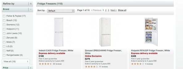
The product filtering on John Lewis was severely lacking from most other sites I visited to compare fridge freezers. Each category of product has slightly different filters – the fridge freezers for instance have brand, price, energy rating, fridge freezer type, frost free (freezer), and then the additional filters of type, colour, width refrigeration and rating.
There are quite a number of brands, so JL have shown the popular ones and then provided a handy expansion to see all the rest of the brands if you want to narrow it down. Handily they provide a number in each category too so you know how far you’re narrowing down your options.
As you interact with the filters the products and thumbnails begin to refresh, and so do the filters below. This saves time on page loading, and allows you to change your mind quickly. Once you have the filters in place, you can reorder and compare up to four side by side which makes comparison shopping a breeze.
What do you like and dislike?
Do you disagree? Do you hate the big menus and find the filters illogical? What have you spotted that you think is neat? I’d love to hear different opinions, so leave me a comment.
The image in the header of this post is CC use of: Westfield Stratford City – John Lewis by EG Focus on Flickr.


